import numpy as np
Matplotlib
MatPlotLib is the reference library for plotting, it is also the oldest and it must be admitted that it is not always easy to use.
Note for Jupyter
In Jupyter, it is necessary to specify that you want the figures to be included in the HTML sheet. This is done as follows:
% matplotlib inline
and if you have a screen with high resolution, use retina rendering with:
% config InlineBackend.figure_format = 'retina'
You can test with and without this last option to see the difference (you have to restart the kernel).
%matplotlib inline
%config InlineBackend.figure_format = 'retina'

import matplotlib.pyplot as plt
Cette page est une très rapide introcution. Je vous donne des liens à la fin pour aller plus loin.
The curves
Graphing a function is equivalent to give two vectors of the same size, x and y values, to the plot function.
x = np.linspace(0,10,50)  # (start, end, number of values)
y = np.sin(x)

plt.plot(x,y)
plt.plot(x, np.cos(x), 'r^')
[<matplotlib.lines.Line2D at 0x7f4234bb8550>]

Where 'r ^' means red triangles. Here are the choices to make the magic string that describes the style of the curve:
- color = (
b: blue,g: green,r: red,c: cyan,m: magenta,y: yellow,k: black,w: white) - markers = (
o,v,^,<,>,8,s,p,*,h,H,D,d) (see doc plot section Notes) - style of line = (
:= dotted line,-= continuous,-.= dash-dot,--= dashes)
fig = plt.figure(figsize=(10,6))

plt.title(u"What a curve!")
plt.xlabel('fifty values from 0 to 10 but you cannot see them')
plt.ylabel('roots which are square')
plt.plot(x, np.sqrt(x), '--g', label=r"$\sqrt{x}$") # LaTeX math string
plt.plot([0,4],[2,2],':', color = '#00aadd', lw=3)
plt.plot([4,4],[0,2],':', color = '#00aadd', lw=3)
plt.text(4, 2.3, r"$\sqrt{4} = 2$", horizontalalignment='center',size=16)  # LaTeX text with r"$...$"
plt.annotate(r"it's here", xy=(4,2), xytext=(4.5,1.6), arrowprops=dict(arrowstyle="-|>"))
plt.legend()
<matplotlib.legend.Legend at 0x7f4234bf9d90>

Curves + bars with two scales
Here is a figure with
- dates on the x-axis,
- the incomes in the form of bars with its y-axis on the left,
- the number of PayPal users as curves with its y-axis on the right.
The first part is just the data. The figure starts at f1 = plt.subplots. We need to use subplot and twinx to have both drawings in the same figure. Since the drawings are superimposed, only one sub-figure is used for the two drawings ax1 and ax2.
Finally some default settings are changed to choose where to place the caption and font size.
Note that if we reverse the two drawings then the bars will be drawn over the curves. To continue to see the curves it is necessary to use the transparency with the parameter alpha (0 = transparent, 1 = opaque).
import matplotlib.dates as dates
dates.DateFormatter('%d/%m/%Y')

comptes = {'15/01/00':0.1, '15/03/00':1, '15/08/00':3, '15/06/02':20, '15/11/03':35, '31/03/05':71.6, '31/03/07':143, '30/03/06':105}
new_comptes = {dates.datestr2num(i):comptes[i] for i in comptes.keys()} # on convertit les dates
anc = sorted(new_comptes.keys())

actifs = {'31/12/05':28.1, '31/12/06':37.6, '15/07/08':60, '30/03/09':73, '15/06/10':87, '15/06/12':113, '15/03/13':128}
new_actifs = {dates.datestr2num(i):actifs[i] for i in actifs.keys()} # on convertit les dates
ana = sorted(new_actifs.keys())

ca = {'1/1/12':5.6, '1/1/11':4.4, '1/1/10':3.4, '1/1/09':2.76, '1/1/08':2.5, '1/1/07':2., '1/1/04':1.4, '1/1/02':.2}
new_ca = {dates.datestr2num(i):ca[i] for i in ca.keys()} # on convertit les dates
anca = sorted(new_ca.keys())

f1, ax1 = plt.subplots(figsize=(10,4), dpi=100)
ax2 = ax1.twinx() # set y axis for ax2 on the right side

ax1.set_ylabel('CA en milliards de $', fontsize='large')
ax1.bar(anca, [new_ca[i] for i in anca], width=0.9*(anca[-1]-anca[-2]), color='g', alpha=0.3, label="CA")

ax2.set_ylabel('comptes en millions', fontsize='large')
ax2.plot_date(anc, [new_comptes[i] for i in anc], 'b-o', label="compte ouvert")
ax2.plot_date(ana, [new_actifs[i] for i in ana], 'r-o', label="compte actif")

plt.title("Chiffre d'affaire et utilisateurs de Paypal")
plt.rcParams['legend.loc'] = 'upper left' # force to place the legend on the upper left corner
plt.rcParams.update({'font.size': 10})
ax2.legend()
<matplotlib.legend.Legend at 0x7f422c9c53d0>

Save
And here's how to save a figure. Here the requested file is a PDF but it could be a PNG (image) or an SVG (vector figure).
f1.savefig('/tmp/paypal.pdf')

!ls -l /tmp/paypal.pdf
-rw-r--r-- 1 jovyan users 15437 Feb 26 16:43 /tmp/paypal.pdf
Curve in 3D
To finish an example of a 3-dimensional curve. Note that the drawings ax1 and ax2 must be in 3D which requires to specify it by adding subplot_kw = {'projection':'3d'}.
If you want to mix 3D drawings and 2D drawings, you need to create subplots differently. Take a look at this same example with the add_ subplot function that defines the drawings one by one: 3D plots as subplots.
from mpl_toolkits.mplot3d.axes3d import Axes3D, get_test_data
from matplotlib import cm

fig, (ax1, ax2) = plt.subplots(1, 2, figsize=(16,6), subplot_kw={'projection':'3d'})

#  First subplot
X = np.arange(-5, 5, 0.25)
Y = np.arange(-5, 5, 0.25)
X, Y = np.meshgrid(X, Y)
R = np.sqrt(X**2 + Y**2)
Z = np.sin(R)
surf = ax1.plot_surface(X, Y, Z, rstride=1, cstride=1, cmap=cm.coolwarm,
                       linewidth=0, antialiased=False)
ax1.set_zlim(-1.01, 1.01)
fig.colorbar(surf, shrink=0.5, aspect=10)

# Second subplot
X, Y, Z = get_test_data(0.05)
ax2.plot_wireframe(X, Y, Z, rstride=10, cstride=10)
<mpl_toolkits.mplot3d.art3d.Line3DCollection at 0x7f4293dbf4d0>

Un tutorial plus approfondi
Matplotlib tutorial by Nicolas P. Rougier avec des exercices à la fin.
More
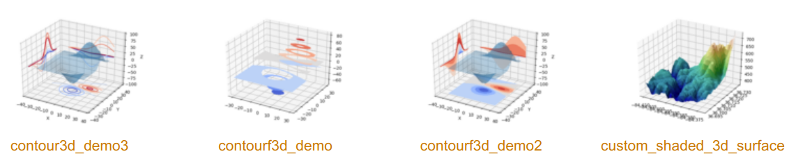
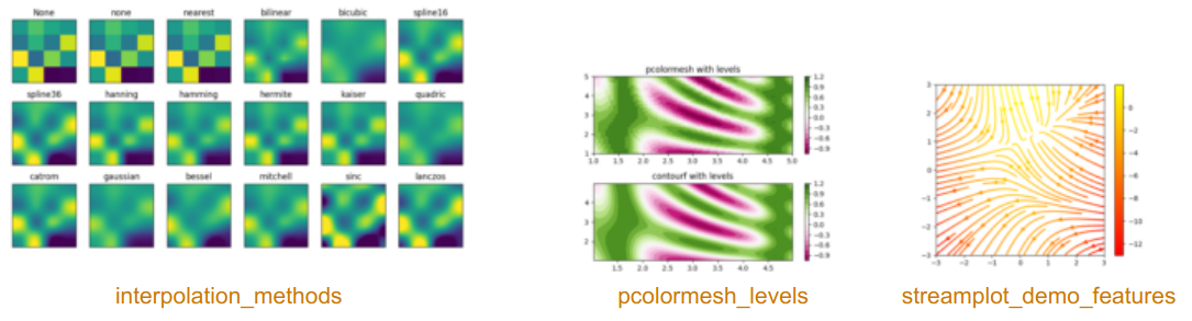
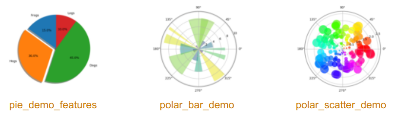
The main advantage of MatPlotLib is you can do almost everything and thanks to thousands examples, tutorials, explanations, you may succeed to do it! It can be 3D, histograms, images, contours, pies, polar charts... Here are galleries with examples to get an idea of possibilities:
- The official gallery
- Frédéric Rougier's small gallery (often easier to understand)
Here few figures from the official gallery: